


Design Details That Quietly Differentiate Premium Brands
GUEST POST.
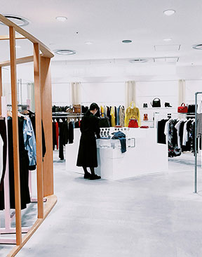
Image Photo by Ceyda Çiftci on Unsplash
Our perception of quality is changing. It is always changing. As cultural and technological shifts continue to reshape the human experience – particularly the Western experience – so too are we as people reconsidering what connotes ‘value’.
It is an interesting time to be a product designer, a marketer and even a retailer, for certain; a time of constant upheaval, defined (for better or for worse) by the ‘move fast, break things’ motto of the tech leaders that shape our digital experience. In amongst it, though, a customer base that’s more discerning than ever; more distrusting of flashy spectacle than ever, too.
In the wake of overt branding, AI and the increasing volume of the second screen, customers are beginning to value quiet confidence over brash claims. And premium brands are increasingly relying on subtlety rather than spectacle, to great effect. Customers pick up on atmosphere, flow, and brand consistency in retail sites, even if they cannot immediately name the details shaping that experience. How best, then, to utilise this new normal?
Detail as a Marker of Brand Intent
This new normal has existed for some time. It’s called ‘quiet design’, and it is used in every customer-facing industry for the betterment of the consumer experience. Now, though, it is truly having its moment. Quiet design is frequently discussed in digital circles with respect to app and web design – but it has just as much, if not more, import to brand intent in physical realms. This means that quiet-designed spaces are potent tools.
Carefully chosen materials, austere and minimalist finishes, and clever spatial transitions are all subliminal signifiers of quality and confidence. Any retail environment that makes effective use of minimal design, quality materials and smart zoning is positioning itself as an almost futuristic, utopian vision; even now, Apple’s storefronts are timeless and excellent examples of how restraint builds trust and credibility.
How Lighting Supports Identity Without Dominating It
One of the secret weapons in any brand’s quietly designed identity is lighting and its judicious use. Lighting serves so many purposes, from the practical to the aesthetic; leveraging these correctly enables a brand to curate the customer experience far beyond the obvious.
Overhead lighting defines the colour and temperature of a space, while ambient lighting deployed in corners can soften harshness. LED strip lights are discreet sources of accent lighting, which enable you to highlight architectural lines, joinery or shelving – and the products displayed upon them – without visual distraction. This ‘magical’ lighting effect is subtle and effective in drawing customer attention and keeping physical spaces clean-feeling in the process.
Designing for Experience, Not Attention
Customer attention is important, but should not be chased as doggedly as one might assume. By over-focusing on customer attention and the catching thereof, a brand runs the risk of falling into the very pitfall it is trying to avoid: noise, brashness, and maximalism. Brands ultimately benefit when spaces feel intuitive and comfortable rather than theatrical. This is why the customer experience is the most important aspect to consider and why serious thought should be given to subtle design choices. Thoughtful detailing improves navigation, dwell time, and emotional response in one.
This is a guest post and therefore these are not necessarily the views of Index Digital.
#ShopLighting #BrandDesigns #IndexDigital